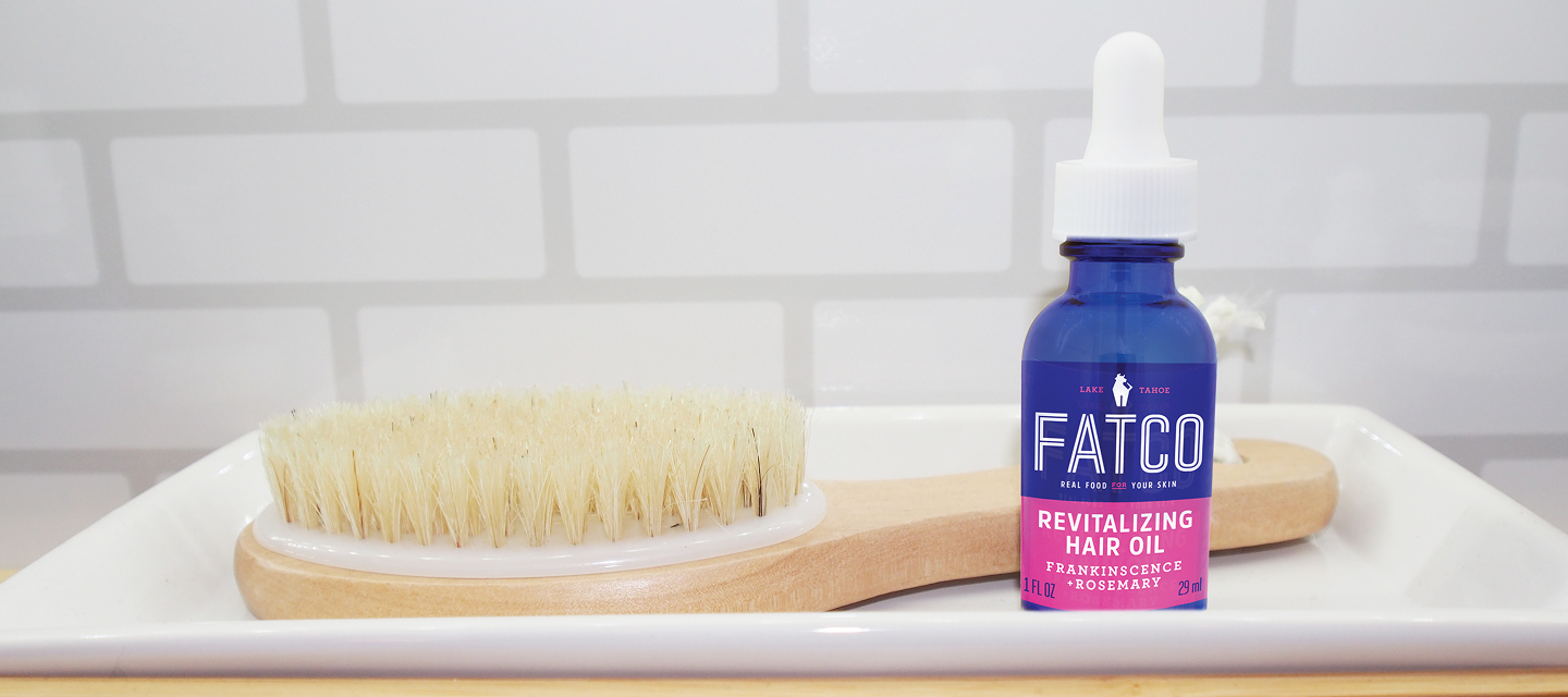
FATCO®
Owning the word fat turned controversy into confidence and a farmers market favorite into a national brand.
The Opportunity
When founder Cassie Burnvoth first came to us, her brand was a beloved farmers market staple called Fatface Skincare. Built around grass-fed beef tallow (yes, fat), it had a loyal following and a strong product lineup—from deodorant to face creams. But Cassie had her sights set on going national.
There was just one hitch: the name. “Fat Face Skincare” was long, hard to scale on small packaging real estate, and entangled in trademark opposition with a UK fashion brand.
The Name
We named it FATCO®.
FATCO distilled everything important about the brand into a compact, iconic mark that held power even on the smallest packaging. It kept the core ingredient ‘fat’ front and center, ensuring it was bold enough for national retail.
We also branded the tagline Fat is Your Friend® and reinforced Cassie’s existing core message “Real Food for Your Skin.” Together, they reframed fat as nourishing rather than frightening serving as an educational bridge for customers new to tallow-based skincare.
Within roughly a year, FATCO landed on shelves at Target—a massive leap from farmers market stand to national retailer. The new name didn’t just look bigger, it made the brand feel ready for prime time.
Yep, we named it. And we also branded it.
For the full brand experience — identity, packaging, messaging, website, expo, and asset execution — visit our sister site, Shelf Studio.
.png)
.png)
.png)
.png)
.png)
.png)

.png)

